User engagement is more than just a buzzword. It’s a measurement of the totality of the user’s experience with your site. It tracks what your user sees, what they click, what they’ve read, and what they’ve skipped over. Not only that, but it also includes user satisfaction, how many visitors stop navigating the site, and which users reach their goals.

It’s through this engagement that users become customers, and customers become returning customers. This is why boosting engagement is well worth your while. Customers who are fully engaged represent a 23% higher share in profitability. It even works on B2B customers, who have a 63% lower rate of attrition if fully engaged.
Managing engagement and boosting it is a complex undertaking. It involves both highly technical concerns and high-level strategic thinking. To help you navigate this profitable but challenging field, we’ve rounded up several ready-to-use ideas for boosting engagement today.
Manage the Complete User Journey
Many businesses today are opting for all-in-one CRM solutions, and you should definitely consider that as well. Typically, the journey from first-time visitor to long-time returning customer is continuous. You want software that will help you track and keep up with this entire journey. It should hold all the necessary data to facilitate sales, personalize marketing, and provide customer support.
With only one platform, you can integrate different operations, link sales and marketing, and thus avoid duplication of work. Using just one database also means that there’s only one database to protect, reducing the odds of leaks. With most of today’s CRMs being software-as-a-service products, using just one helps you only pay for the features you use.
The data you collect in your CRM database through tracking all your customer-facing operations has many uses. It can help you increase user engagement by providing targeting for your marketing material and convenience for the user.
Speed Matters
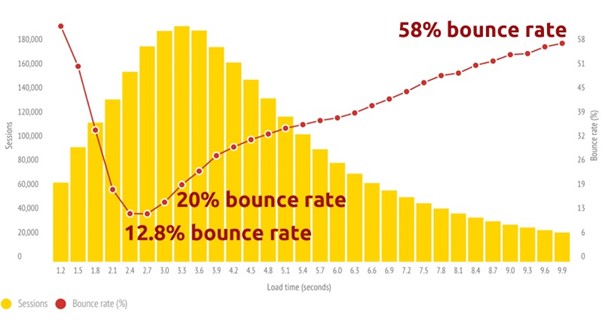
Users have remarkably little patience for slow sites. The time you have at your disposal to leave a good impression for a first-time visitor is measured in milliseconds, and a blank page is not what they should see. Studies have shown that even a load time increase from 2.4 to 3.5 seconds can increase the bounce rate by a staggering 56.25%. This is obviously a concern, as users who never even see your site will never be converted into customers.

Picture 1. Bounce rate statistics (Source: Convert.com)
What makes a site slow? Essentially, modern front-end coding practices can often lead to using superfluous libraries. An analysis of your site’s technical underpinnings may reveal there are whole seconds to be saved just by removing unused JavaScript. JavaScript is also responsible for another leading cause of slowdown: render-blocking.
Render-blocking
Render-blocking stops the site from displaying until absolutely all the content has been transferred and parsed fully. Often, not all of it is necessary, and very little is needed to at least start displaying the site. It can be very useful to embed the necessary parts for immediate access while the rest is loaded later.
Resources
You can also make sure all the resources you load are as compressed as possible. If your site is image-heavy or heavily animated, encoding your pictures intelligently will go a long way in speeding things up. The first step is to select efficient, modern formats: JPEG 2000 for still images, for instance, and WebP as a much-improved alternative to GIFs. Step two is managing size by adjusting the site to not load a full-size image when only a thumbnail is required.
Each site is slowed down by a collection of factors unique to it. To learn about your site, you need a tool capable of analyzing the behavior of the site in full and identifying the causes of the slowdown. Google’s page speed insights represent a free, sophisticated version of just such a tool. Run it on your site immediately to see actionable advice on what to fix.
Responsive Design
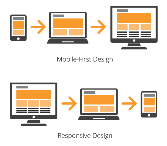
Forty percent of all online transactions are done using mobile devices. And no matter how laptop-like mobile devices become, a site’s interface still needs to be adapted to their needs. There’s no need to pick mobile over desktop, however, or vice-versa. A lot of mobile-first designs create sites nobody can use on computers, repelling potential users. There’s also no need to make your site several times for each form-factor you expect it to be used in.
The universal solution is to use responsive design. This is a now mature set of technologies that permits your design to recognize the dimensions it is displayed in. With this information, as well as the nature of the device used, the interface can adjust dynamically. This can be as simple as adjusting margins or as complex as reflowing the entire site into one column layout if a smartphone in portrait mode is detected.

Picture 2. Mobile-first vs. Responsive design
Choose Content Carefully
No matter how dynamic, quick, and excellently designed your site is, it lives or dies based on its content. To boost engagement, you need to provide content that the user will find useful. Marketing copy can be ignored—anyone who’s spent more than ten seconds online knows what it looks like. News articles flood the web and are not searched for as much. The secret to being noticed is to be needed. Highly targeted, useful content is key.
Topical blog posts and tutorials are what keeps users coming back. Just blogging can lead to 126% more leads, and tutorials can help your target audience see your site as a resource. This instantly lends it a degree of trust that a site preoccupied only with selling something can hardly muster. Conducting a thorough analysis of your previous content can provide you clarity on what topics you’re covering well and where there are gaps. This is where expertise from SEO agency professionals can come in handy and help on improving your content strategy.
Chatbots for Direct Communication
Sixty-nine percent of consumers prefer to use chatbots to communicate with businesses. A chatbot represents a clear, obvious engagement and interaction point. Instead of hunting for the correct link or navigating a resource center, the user can instead just ask. The simplicity of the interface means that help can be a click away no matter what goes wrong.

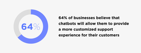
Picture 3. Chatbots for personalized experience
Fortunately, there are also great out-of-the-box solutions that make it easy to learn how to add a chatbot to your website. These solutions enable you to program a template with the expected conversation flow, taking into account the most frequently asked questions and their answers. This can help you take on a surprising number of user questions, and the things your AI can’t handle can be seamlessly handed over to a human operator.
In Conclusion
By now, you are more than aware of how vital user engagement is for growing your website. Take into consideration the ideas we’ve discussed in this post and focus on improving your website’s overall performance. With a bit of dedication and strategic thinking, you’re bound to see the engagement boost you need.
Author
Tamara Novitovic is a content and SEO specialist that has many articles published with the main focus on brands that want to grow in the fast-changing and demanding market. Her personal favorites are the successes of SaaS startups and young IT entrepreneurs.


